Landing pages are the heart of many online marketing campaigns. Whether you’re running ads, driving email traffic, or offering downloadable resources, the design of your landing page can make or break its success. While engaging headlines and robust content are crucial, incorporating eye-catching designs draws your visitors in and holds their attention.
This blog explores why visually compelling landing pages work, the psychology behind their success, and, most importantly, actionable tips to help you design landing pages that convert.
Understanding the Basics of Effective Landing Page Design
What Makes a Landing Page Effective?
An effective landing page is one that achieves its intended goal — whether that’s collecting leads, driving sales, or encouraging sign-ups. The essentials include clear messaging, mobile-friendly functionality, fast load times, and, of course, an eye-catching design that keeps users engaged while guiding them toward a call-to-action (CTA).
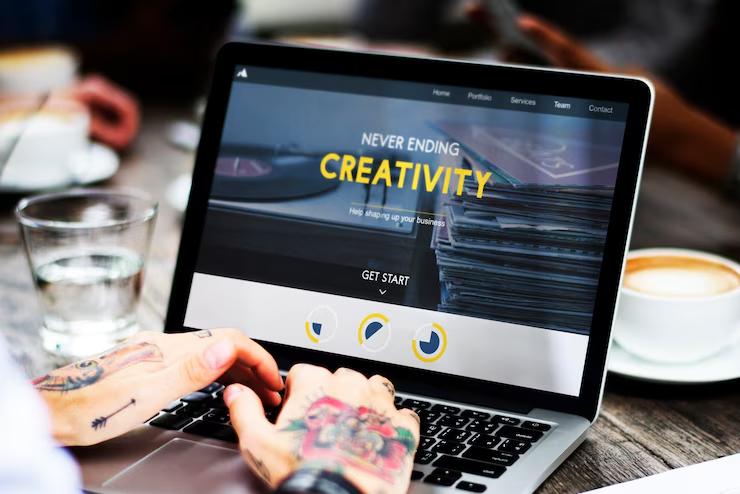
Elements of a High-Converting Landing Page
Here’s what most high-converting landing pages include:
- A clear value proposition. Your visitors should know exactly what they’re getting in just a few seconds.
- Visually prominent CTA buttons. Buttons like “Get Started” or “Subscribe Now” should be bold, colorful, and impossible to miss.
- Minimal distractions. Avoid clutter by keeping the design clean and user-focused.
- Social proof. Testimonials, reviews, or logos from big-name clients add credibility.
- Responsive design. Your landing page must adjust seamlessly for mobile and tablet users.
The Psychology Behind Eye-Catching Designs
How Colors, Fonts, and Images Influence Visitor Behavior
Design aesthetics play a subconscious role in your visitors’ decision-making process.
- Colors evoke emotions. For example, blue conveys trust, red sparks urgency, and green promotes a sense of growth or harmony. Selecting the right color palette can amplify your message’s impact.
- Fonts communicate personality. A modern sans-serif font might suggest innovation, while a serif font can convey authority and tradition.
- Images humanize your brand. High-quality photos of happy, relatable people can create an emotional connection, while illustrations or videos can make your page more memorable.
The Role of Visual Hierarchy in Guiding User Attention
Visual hierarchy ensures the most critical information grabs attention first. Visitors naturally scan pages from top to bottom and left to right, so elements like headlines, videos, or CTAs should follow this flow.
Use bold typography for primary messages, eye-catching buttons for CTAs, and white space to ensure the visitor’s attention is not overwhelmed.
Real-Life Examples of Eye-Catching Landing Pages
Case Study 1: AirBnB’s Host Sign-Up Page
Design Elements:
- Bright, inviting imagery of real homes and hosts.
- A powerful CTA button labeled “Try Hosting,” strategically placed near the top.
- Clean typography paired with minimal distractions.
Impact: Simplistic yet vibrant visuals encourage users to explore hosting opportunities while fostering trust.
Case Study 2: Slack’s Free Trial Landing Page
Design Elements:
- A striking color palette that aligns with its brand identity.
- A seamless blend of graphic illustrations and screenshots of its interface.
- Multiple visual CTAs like “Get Started” prominently positioned.
Impact: The approachable design says “user-friendly” at a glance and effectively converts prospects into trial users.
Practical Tips for Creating Eye-Catching Landing Pages
Tools and Resources for Non-Designers
You don’t have to be a seasoned designer to create visually appealing pages:
- Canva. Create beautiful graphics in minutes using templates.
- Figma. Perfect for wireframing and collaborative design work.
- Unsplash/Pexels. Access royalty-free, high-quality images to enrich your landing pages.
Best Practices for Integrating Design with Content
- Strike the balance between visuals and text—too much of either can overwhelm visitors.
- Use consistent colors and fonts aligned with your brand identity.
- Limit choices; one primary CTA and minimal links ensure users stay on task.
- Focus on above-the-fold design. Make the most crucial information visible without scrolling.
A/B Testing and Measuring Design Effectiveness
Why Testing Design Elements is Essential
A/B testing allows you to experiment with different design variations, ensuring your page resonates with your audience. Test features like button placement, headline size, or even background images to see what drives higher conversion rates.
Metrics to Track for Design Performance
- Conversion rate. The percentage of visitors taking action on your page reveals its effectiveness.
- Bounce rate. A lower bounce rate suggests that users are finding your page engaging and staying longer.
- Click-through rate (CTR). Monitor how often CTAs are clicked to gauge user interest and curiosity.
Future Trends in Landing Page Design
Emerging Design Trends
- Interactive design. Features like sliders, quizzes, or animations keep visitors engaged longer.
- Dark mode. Providing this visually comfortable option boosts user experience.
- Micro-interactions. Subtle design animations, like buttons that “pulse” when hovered over, improve usability.
Staying Ahead with Innovative Designs
To stay competitive, businesses should continuously evolve their landing pages based on audience preferences and design trends. Keep an eye on developments in user experience (UX) design, accessibility tools, and AI-driven personalization to maintain an edge.
Step Up Your Landing Pages Today
Eye-catching designs go beyond aesthetics—they’re a powerful tool for turning visitors into loyal customers. Whether it’s through impactful colors, compelling visuals, or easy-to-use layouts, a well-designed landing page can significantly improve your online marketing results.
It’s time to turn your ideas into action. Revisit your existing landing pages, apply some of these proven strategies, and start experimenting with fresh designs. The rewards—higher engagement, more leads, and increased conversions—are well worth it.